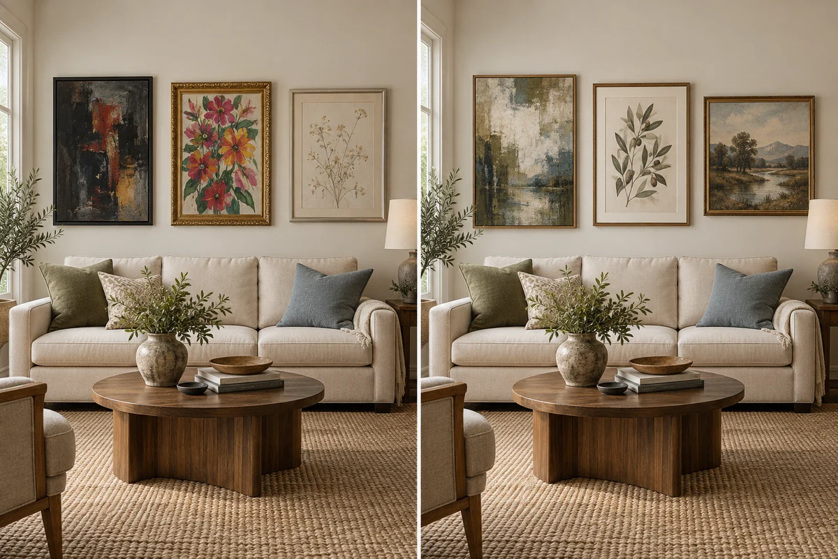
Wall art does not need to match every color in a room. A more useful approach is to decide whether the artwork should repeat an existing color, introduce contrast, or connect several colors already present. The wall matters, but so do the sofa, rug, curtains, wood, metal finishes, natural light, and frame.
Exact matching can make a painting disappear into its surroundings, while deliberate contrast can turn it into the focal point. Neither outcome is automatically right or wrong. The goal is to choose the relationship you want before comparing paintings.
Three Ways to Match Art With a Room
Start With the Room, Not a Paint Swatch
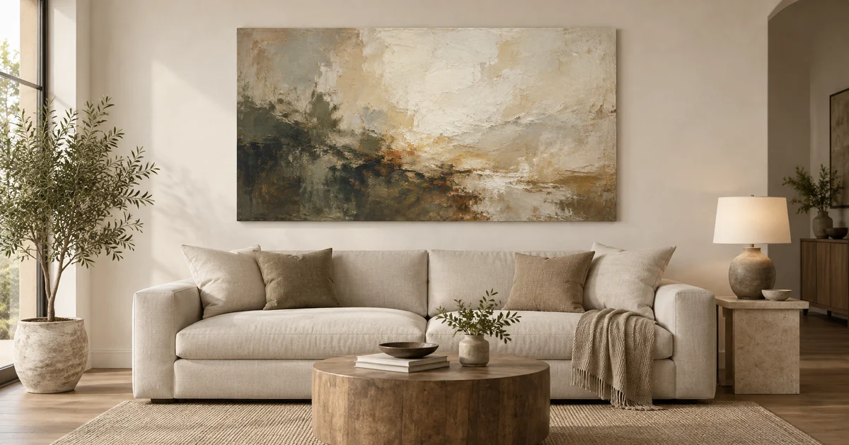
Before opening a color chart, look at the room as a set of large and small color areas. The walls may be the largest area, but a dark sofa, patterned rug, long curtains, or broad wood cabinet can carry more visual weight. List the wall color, largest furniture color, rug, curtains, wood tone, metal finishes, and the accents already present in cushions, ceramics, or books.
Next, observe the room in daylight and after the lamps are on. A warm white wall can look cream beside honey-colored wood and more neutral beside a blue-gray sofa. Paint and textiles also change with direction of light, surface sheen, and nearby colors. A hexadecimal color sampled from one photograph cannot represent all of those conditions.
Finally, decide what the painting should do. Should it settle into a quiet reading corner, give a beige room a natural green note, or become the strongest color in an otherwise restrained living room? This intention is more useful than trying to find an identical beige, gray, or blue.
The Three Ways Art Can Relate to Room Color
Repeat
Repeat means that the painting contains one or two colors already present in the room. A botanical work might echo a green cushion; a landscape might pick up the muted blue of curtains; an earthy abstract might repeat the tone of a leather chair. The repeated color does not need to be identical. A lighter, darker, grayer, or more saturated version can feel connected without looking copied.
This is the easiest route when several room elements already belong to one palette. Keep the connection selective. Repeating the sofa, rug, wall, and every accessory can make the painting feel selected to complete a scheme rather than chosen as art.
Contrast
Contrast introduces a color or value that appears rarely, or not at all, elsewhere in the room. A blue seascape can bring clarity to a warm beige space. A colorful abstract can animate gray upholstery and off-white walls. A light painting can separate strongly from a deep green wall.
Contrast is intentional, not accidental. It works best when the painting has enough visual scale to hold attention and when the rest of the room gives it space. If the new color feels isolated, repeat a small trace elsewhere with a book, cushion, vase, or throw. That secondary echo is optional; the room does not need a full set of matching accessories.
Bridge
Bridge is useful when the room already contains several colors that do not obviously connect. Look for a painting that includes a wall-related neutral, a furniture-related tone, and one existing accent. For example, a work with warm white, brown, and olive can connect an ivory wall, walnut-finish cabinet, and green textile.
The bridge does not have to contain every color in equal amounts. One may form the background, another may appear in broad shapes, and the third may be a small accent. What matters is that the artwork gives the eye a route between the room’s main elements.
Should Wall Art Match the Wall Color?
Not exactly. The wall is a backdrop, so first consider separation. If the painting shares the wall’s value and temperature very closely, its outer shape may recede. That can suit a quiet, layered room, especially when texture or a contrasting frame supplies definition. If the painting is much darker, lighter, warmer, or cooler than the wall, it will read as a focal point.
For tone-on-tone placement, vary at least one quality: value, saturation, texture, or frame. A cream painting on a warm white wall may still stand out through dark marks and raised brushwork. For contrast, check that the difference supports the room rather than fighting another dominant element. A strong orange painting, emerald sofa, and vivid patterned rug can each be attractive but may compete when all demand equal attention.
Should Artwork Match the Sofa or Furniture?
Artwork does not need to copy the sofa. Large furniture is important because it sits in the same field of view, but it offers several possible relationships. The painting can repeat one upholstery color, echo an accent cushion, contrast with the sofa, or bridge the sofa to the wall and rug.
Think about material as well as hue. A smooth cool-gray sofa may benefit from warmer paint handling or a natural-looking frame finish. A richly grained cabinet can connect with a painting through an earthy passage without matching the wood exactly. If the furniture is patterned, use the overall impression from normal viewing distance rather than trying to reproduce every small color.
Warm vs. Cool Undertones
An undertone is the color bias beneath the first label. Cream, tan, terracotta, yellow-beige, warm white, and many wood tones tend to feel warm. Blue-gray, slate, cool white, blue, and some greens tend to feel cool. Greige and gray can move either way depending on what surrounds them.
Place a plain white sheet near the wall, sofa, or fabric and ask whether the surface appears more yellow or red, or more blue or gray. Then decide whether to continue that temperature for harmony or oppose it deliberately. Colors can appear warmer, cooler, lighter, or darker depending on the light and the colors around them, so a screen preview should be treated as guidance rather than calibrated proof.
How to Choose Art for Neutral Rooms
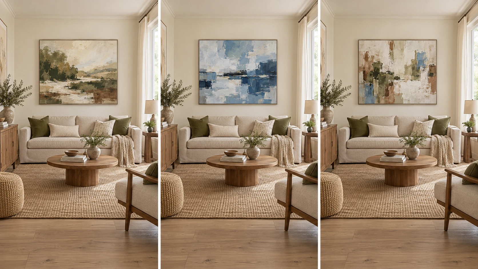
A neutral room does not require neutral art. It gives you at least three clear directions. Keep it quiet with cream, earth, black, soft brown, or restrained gray. Add natural color with botanical green or landscape blue. Create a focal point with a multi-color abstract or a single saturated passage.
Choose according to the role of the room. A bedroom may benefit from quieter contrast, while an entrance or dining area may comfortably support a stronger focal point. Also judge the amount of empty wall around the work. A vivid painting with generous breathing room can feel calmer than several small neutral pieces crowded together.
One Neutral Room, Four Artwork Directions
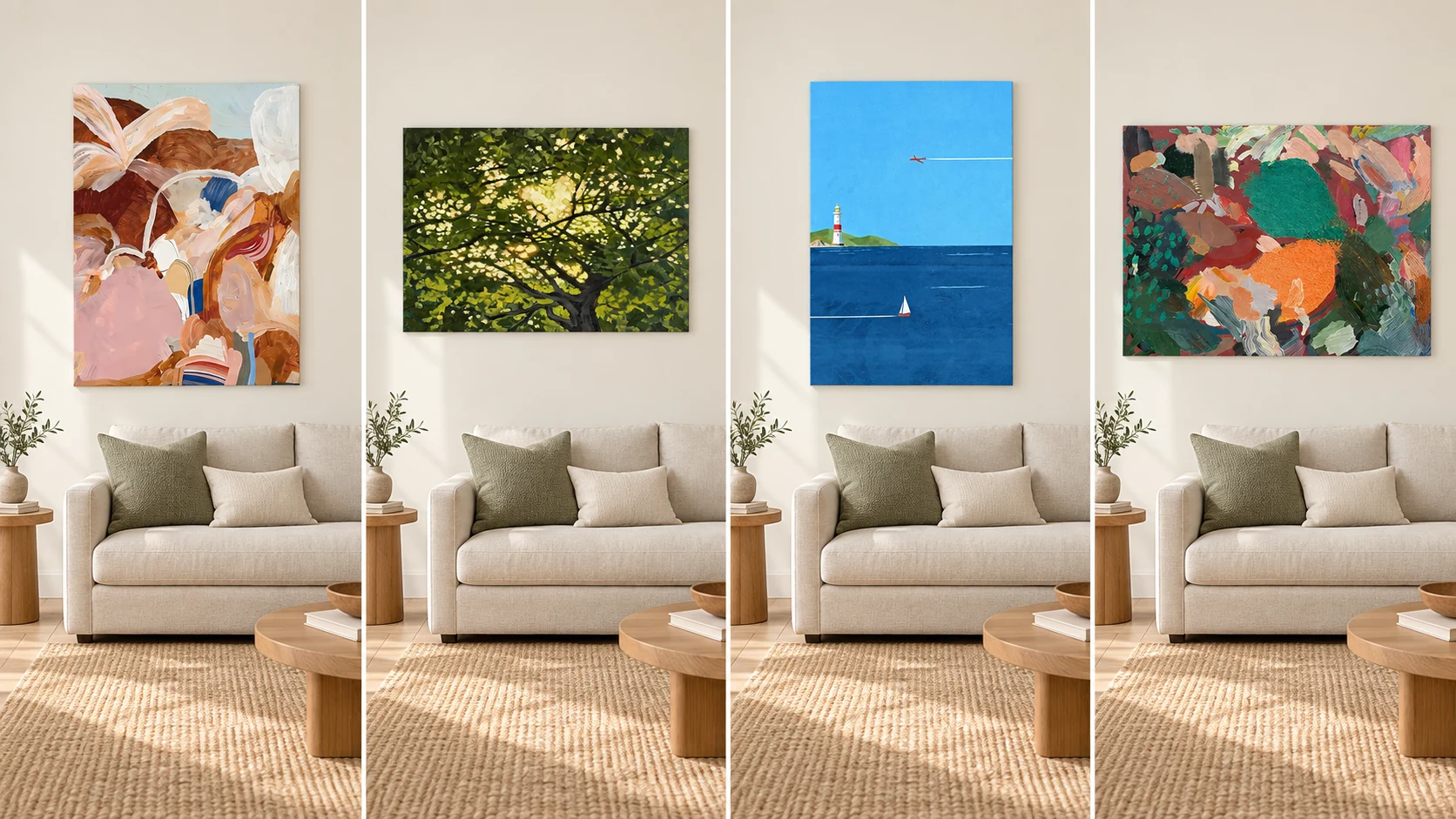
What Art Works With Beige, Greige and Warm White Walls?
These walls can support earth tones, green, muted blue, rust, warm red, and multi-color artwork. The useful question is not which color is universally correct, but how much separation you want. An earthy painting can create a layered tonal result. Green can introduce a natural counterpoint. Muted blue can cool the scheme, while rust or red can strengthen its warmth.
Greige needs a second look. A yellow or taupe-leaning greige usually behaves as a warm neutral; a gray or violet-leaning greige may feel cooler. Compare it with the sofa and floor rather than judging the paint chip alone. If the wall, upholstery, and artwork all sit in a similar mid-value range, use darker marks, lighter passages, or a frame edge to preserve definition.
What Art Works With Gray Walls?
First decide whether the gray is warm or cool. A cool gray with blue artwork can be calm and coherent, but an already cool room may benefit from cream, ochre, rust, warm pink, or brown for balance. A warm gray can accept earthy neutrals easily, while clear blue or green can sharpen the contrast.
Avoid the vague claim that gray goes with everything. Gray changes beside wood, upholstery, and daylight. Charcoal also behaves differently from pale silver-gray because value contrast matters. Test the painting at the intended wall, and check it again at night when bulbs may make the wall warmer.
What Art Works With Green or Blue Walls?
Green walls do not require green paintings, and blue walls do not require blue ones. Use the same three strategies. Tone-on-tone repetition can create depth when the painting contains lighter and darker versions of the wall color. Contrast can use warm earth, cream, coral, orange, or another opposing note. Bridge can combine the wall color with the room’s wood and upholstery tones.
Dark colored walls increase the importance of value. A pale painting may appear crisp and graphic, while a dark painting can feel enveloping. On a muted blue wall, a seascape may merge gently; the same work on warm white may become the room’s clearest cool element. Neither placement is inherently better.
How Much Color Should a Painting Repeat?
One or two recognizable connections are usually enough. A repeated color can occupy a large area or appear as a small but noticeable passage. Look from the doorway or across the room: if you can identify a relationship without hunting for it, the connection is doing its job.
Dominant, supporting, and accent are more flexible ideas than a fixed percentage. Rules such as 60/30/10 can help someone describe a palette, but they are starting frameworks, not purchase formulas. Paintings distribute color unevenly, and texture, value, subject, and scale affect their impact.
Do Frame Colors Need to Match the Room?
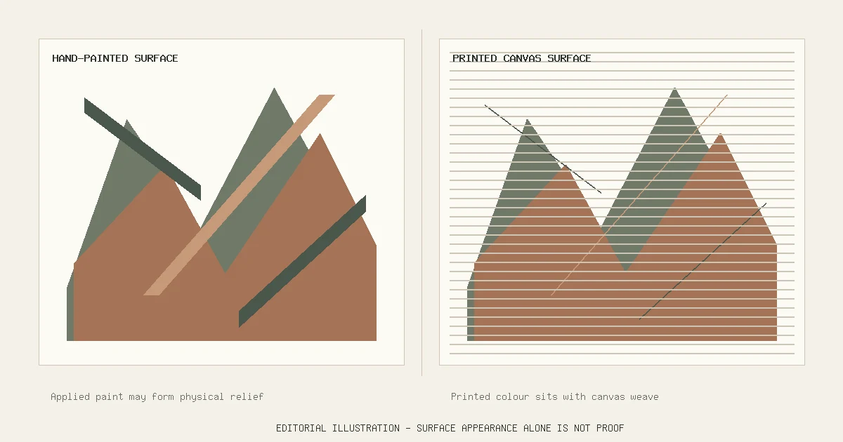
The frame is part of the color relationship, especially when it creates a visible boundary. Black can add graphic separation; a light neutral frame can keep the transition soft; an aluminium-alloy frame can introduce a cooler edge; and a walnut-finish frame can relate to darker warm furniture. A finish name does not prove solid material. For example, a walnut-finish option describes appearance, not solid walnut construction.
The current Room Oil Painting product examples below offer Unframed, PS Frame, Aluminium Alloy Frame, and Walnut-Finish Frame options. Availability varies by product and size. If you are deciding whether the edge should disappear or define the work, see Framed vs. Unframed Oil Paintings.
Real Color Examples From Room Oil Painting
The following observations come from the current straight-on product images, not from title words alone. Screen colors and room visualizations are not calibrated samples, so use these examples to understand relationships rather than to guarantee an exact match.
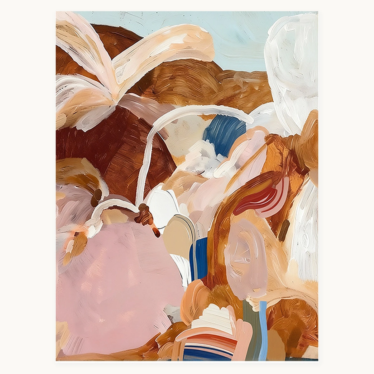
Wabi-Sabi & Neutral · Abstract & Textured
Soft Cadence
Visible colors: cream, blush, tan, rust, brown, white, pale blue, and small deep-blue marks.
Orientation: Portrait. Sizes: 60 × 80 cm through 130 × 180 cm. Frames: Unframed, PS Frame, Aluminium Alloy Frame, or Walnut-Finish Frame.
What this example shows: the broad warm neutrals could repeat a cream sofa and warm wood, while the blue marks can bridge a cooler accent already in the room.
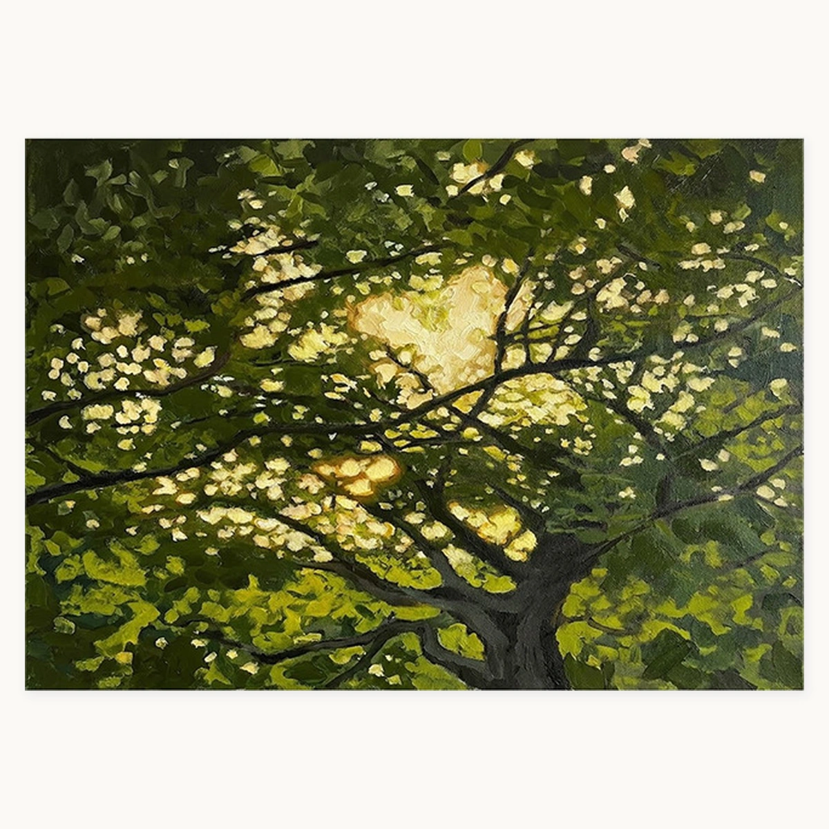
Floral & Botanical · Landscape & Nature
Lush Canopy
Visible colors: deep olive, leaf green, yellow-green, near-black branches, and warm cream light.
Orientation: Landscape. Sizes: 60 × 40 cm through 170 × 120 cm. Frames: Unframed, PS Frame, Aluminium Alloy Frame, or Walnut-Finish Frame.
What this example shows: the painting can repeat existing plant or green textile colors, or bring concentrated natural color into a beige, greige, or warm-white room.

Landscape & Nature
Coastal Stillness
Visible colors: sky blue, navy, white, green, sand, and small red accents.
Orientation: Portrait. Sizes: 50 × 70 cm through 100 × 140 cm. Frames: Unframed, PS Frame, Aluminium Alloy Frame, or Walnut-Finish Frame.
What this example shows: blue could continue a cool palette or contrast with tan upholstery and warm wood. The small green and red areas provide possible bridges without making the whole painting multi-color.
Abstract & Textured
Chromatic Symphony
Visible colors: emerald, forest green, burgundy, coral, orange, blush, cream, brown, and charcoal.
Orientation: Landscape. Sizes: 60 × 80 cm through 120 × 160 cm. Frames: Unframed, PS Frame, Aluminium Alloy Frame, or Walnut-Finish Frame.
What this example shows: a multi-color abstract can act as the focal point in a restrained room, or bridge several accents that would otherwise feel separate.
Do You Need an Exact Color Match?
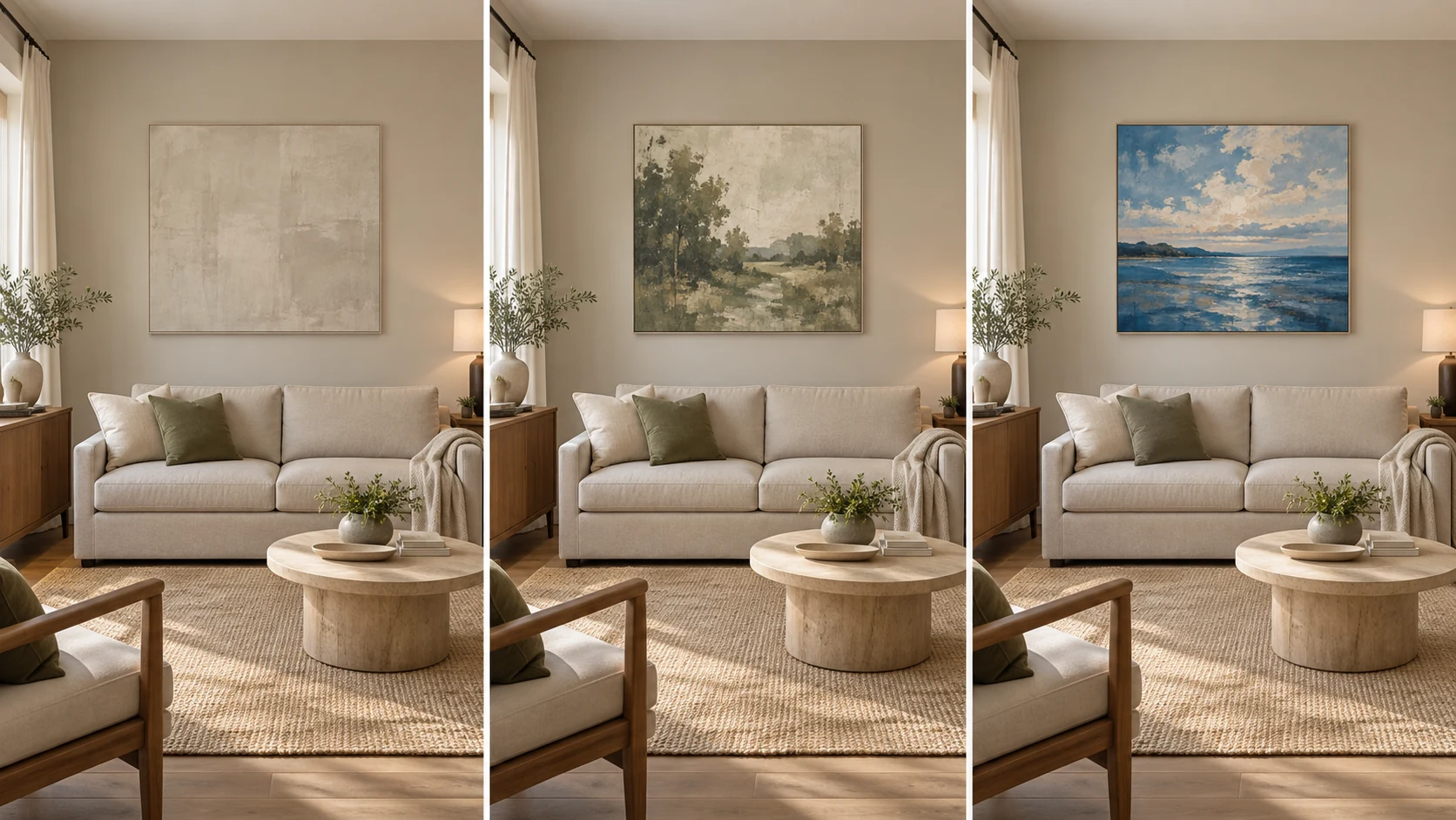
How to Test a Painting Before Buying
- Save the straight-on artwork image. Use a product image rather than judging only from a styled room visualization.
- View it beside the whole room. Include the wall, sofa, rug, curtains, wood, and largest accents in one field of view.
- Name the relationship. Is the painting repeating, contrasting, or bridging? If none applies, decide whether that independence is intentional.
- Reduce the image on your phone. A smaller view helps reveal the dominant color balance that you will notice from across the room.
- Check physical scale separately. Use painter’s tape to mark the proposed outer size. For detailed sizing guidance, see How to Choose the Right Oil Painting Size for Your Wall.
- Look in daylight and lamplight. Warm bulbs, cool daylight, shadows, and reflected colors can alter both the wall and the artwork.
Common Color-Matching Mistakes
- Trying to match every color exactly. This removes useful variation and can make the result feel over-coordinated.
- Matching only the wall. The sofa, rug, wood, curtains, and floor may have greater visual influence.
- Choosing all-neutral art for a neutral room by default. Green, blue, or multi-color work can be equally coherent.
- Ignoring undertones. Two surfaces labeled gray or beige can lean in different directions.
- Ignoring the frame. A dark or metallic edge can change separation and temperature.
- Choosing from a tiny thumbnail. Small previews hide color proportions, texture, and value contrast.
- Treating a visualization as calibrated reality. Screen settings, digital staging, and room lighting can all shift color.
- Focusing on color while ignoring size. A perfectly coordinated painting can still look weak if its scale is wrong.
Room Color Decision Checklist
- Identify the dominant neutral and the largest furniture color.
- Note one or two supporting colors already in the room.
- Decide whether the room leans warm, cool, or mixed.
- Choose Repeat, Contrast, or Bridge as the main intention.
- Check the painting’s dominant colors from a straight-on image.
- Consider the frame as part of the palette.
- Test the intended size and view the room in different light.
- Choose the artwork you want to keep looking at, not merely the closest paint match.
Frequently Asked Questions
Should wall art match the wall color?
No. It can relate through a shared undertone or one repeated color, but it may also contrast deliberately. Consider whether you want the work to recede, connect, or become a focal point.
Should artwork match the sofa?
Not exactly. Artwork can repeat one upholstery color, echo an accent cushion, contrast with the sofa, or bridge the sofa to the wall and rug.
What color wall art works with beige walls?
Beige can support earthy neutrals, green, muted blue, rust, warm red, and multi-color artwork. Check whether the beige leans yellow, pink, taupe, or gray, then choose harmony or contrast intentionally.
What wall art works in a neutral living room?
Neutral art can keep the room quiet, botanical green or landscape blue can add natural color, and a colorful abstract can create a focal point. A neutral room is a flexible background, not a restriction.
Can I hang warm-colored art in a cool room?
Yes. It will usually read as contrast and may balance a room that already feels very cool. Repeat a small warm note elsewhere only if the artwork feels isolated.
Does the frame need to match the furniture?
No. It can relate to furniture, define the artwork against the wall, or remain visually quiet. Use the stated finish accurately and do not infer solid wood from a walnut-look or walnut-finish label.
How can I judge artwork color accurately online?
Use straight-on product images, compare several photos, lower screen brightness if it is unusually high, and remember that screens and lighting shift color. Treat room visualizations as placement guidance rather than calibrated color proof.
Editorial note: Product colors and options shown in this guide reflect the current linked product pages. Screen and room visualization colors may differ from physical viewing conditions.
Browse the complete Room Oil Painting Art Guide for related advice on scale, framing, display, and care.