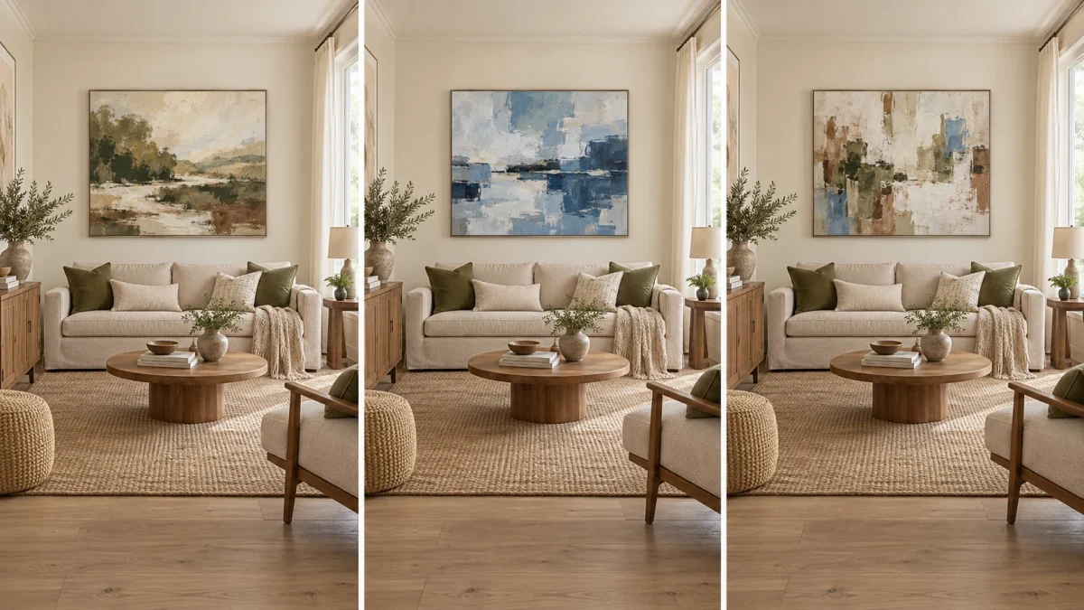
Quick answer
You can mix different art styles in one room without making it feel random when the group has a clear hierarchy and at least one visible connection. Let one style lead, link the works through color, frame tone, subject rhythm or visual weight, balance the strong and quiet pieces, then edit anything that has no job. The aim is not to make every painting match. It is to make their differences feel intentional.
Use the LEAD, LINK, BALANCE, EDIT test: choose a dominant voice, find a common thread, distribute visual weight, and remove the piece that only adds noise.
A room can hold a spare abstract, a detailed botanical painting and a landscape with a vintage character. What usually makes the combination fail is not the difference in style. It is the absence of order. When every work asks for the same amount of attention, colors recur without purpose, and frames create several unrelated outlines, the eye has nowhere to settle.
Cohesion is easier to build when you treat the room as one composition rather than a collection of isolated walls. A painting above the sofa may be the lead. A smaller work by the reading chair can repeat one of its colors. A third work across the room can change the subject while keeping a similar visual weight. The connection may be subtle, but it should be visible from the places where you actually enter, sit and move through the room.
Mixed styles: cohesive versus random
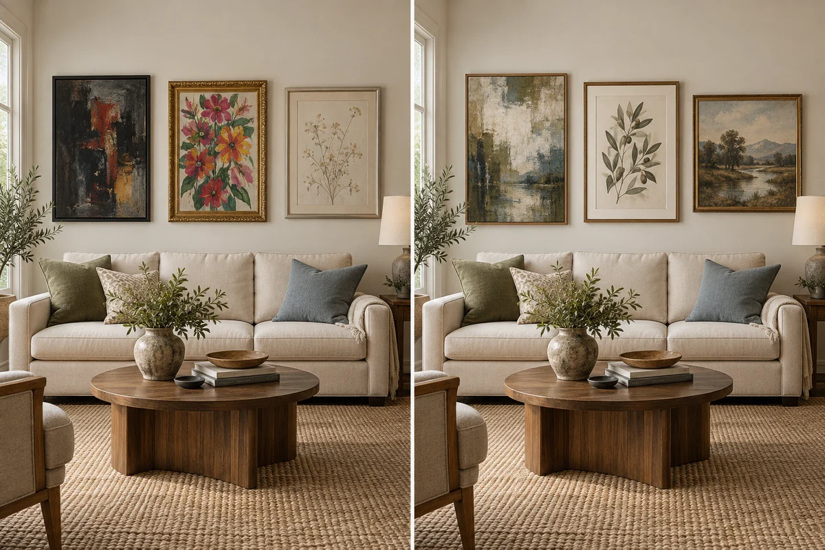
CohesiveShared tone · balanced visual weight · one clear lead
A practical four-step framework
Choose the dominant voice
Decide which artwork or style should be noticed first. The lead is usually the largest piece, the strongest contrast, or the work placed on the main sightline. It does not have to be the brightest. It only needs enough scale, space or contrast to establish the room’s visual direction.
Find one common thread
Connect the other works to the lead through one recurring element: an olive green, a warm off-white ground, dark wood frames, loose brushwork, a vertical rhythm, or a related level of visual density. One good link is stronger than five superficial matches.
Distribute visual weight
Visual weight comes from more than dimensions. Dark color, sharp contrast, dense detail, thick texture and a heavy frame can make a small work feel louder than a larger pale one. Place the strongest pieces far enough apart that they do not compete.
Stop before the room becomes a catalogue
Remove the work that neither leads nor supports. Empty wall is part of the arrangement. It gives a detailed painting room to breathe and lets a quieter work register instead of disappearing between several strong neighbors.
Different styles need one common thread, not one identical look
When people try to make mixed art cohesive, they often over-correct. They repeat the same frame everywhere, choose only one color family, or arrange every work at the same height. The result can be orderly but flat. A better approach is to choose a connection that is strong enough to register while allowing each style to retain its character.
Color is the fastest link, but it is not the only one. A botanical painting and an abstract may share green without sharing a subject. A vintage floral and a contemporary abstract can be separated by decades of visual language yet connected by a warm dark frame tone. A landscape and a non-representational work can feel related because both carry a similar ratio of light to dark and occupy comparable visual weight.
Different styles, one common thread
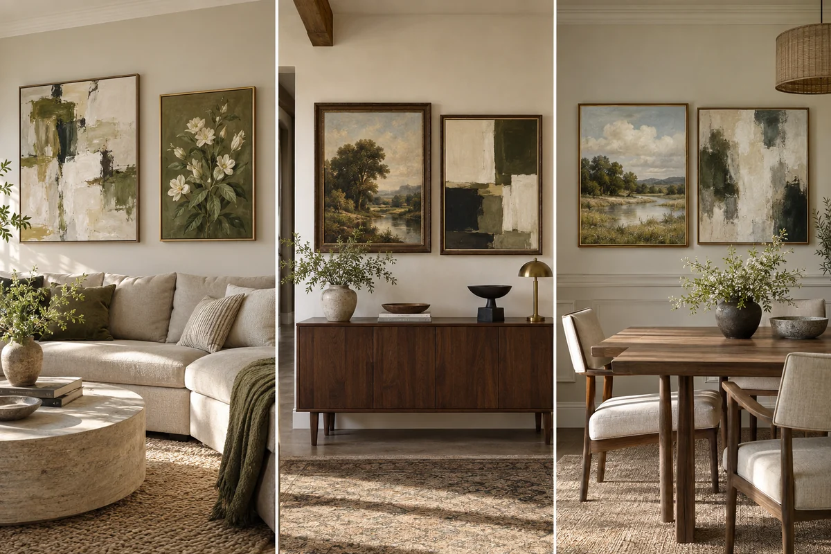
Shared frame toneVintage + contemporary
Shared visual weightLandscape + abstract
Abstract and botanical art: connect energy to structure
Abstract and botanical paintings work well together because both can carry movement. The difference is where that movement comes from. In an abstract, it may come from broad gestures, layered color and changes in texture. In a botanical work, branches, stems and repeated leaf shapes provide the structure. The pair feels intentional when the abstract borrows a color from the botanical, or when both share a similar rhythm even though one is recognisable and the other is not.
In the example below, Soft Cadence is built from pale blue, cream, blush, brown and smaller deep-blue accents. Lush Canopy is much darker and more literal, with olive foliage, near-black branches and warm openings of light. They are not a color match. The useful link is the movement: curved marks in the abstract can answer the branching canopy, while cream and warm earth notes soften the transition between them. Because Lush Canopy has greater dark weight, give it more wall space or place it farther from the room’s other strong focal point.
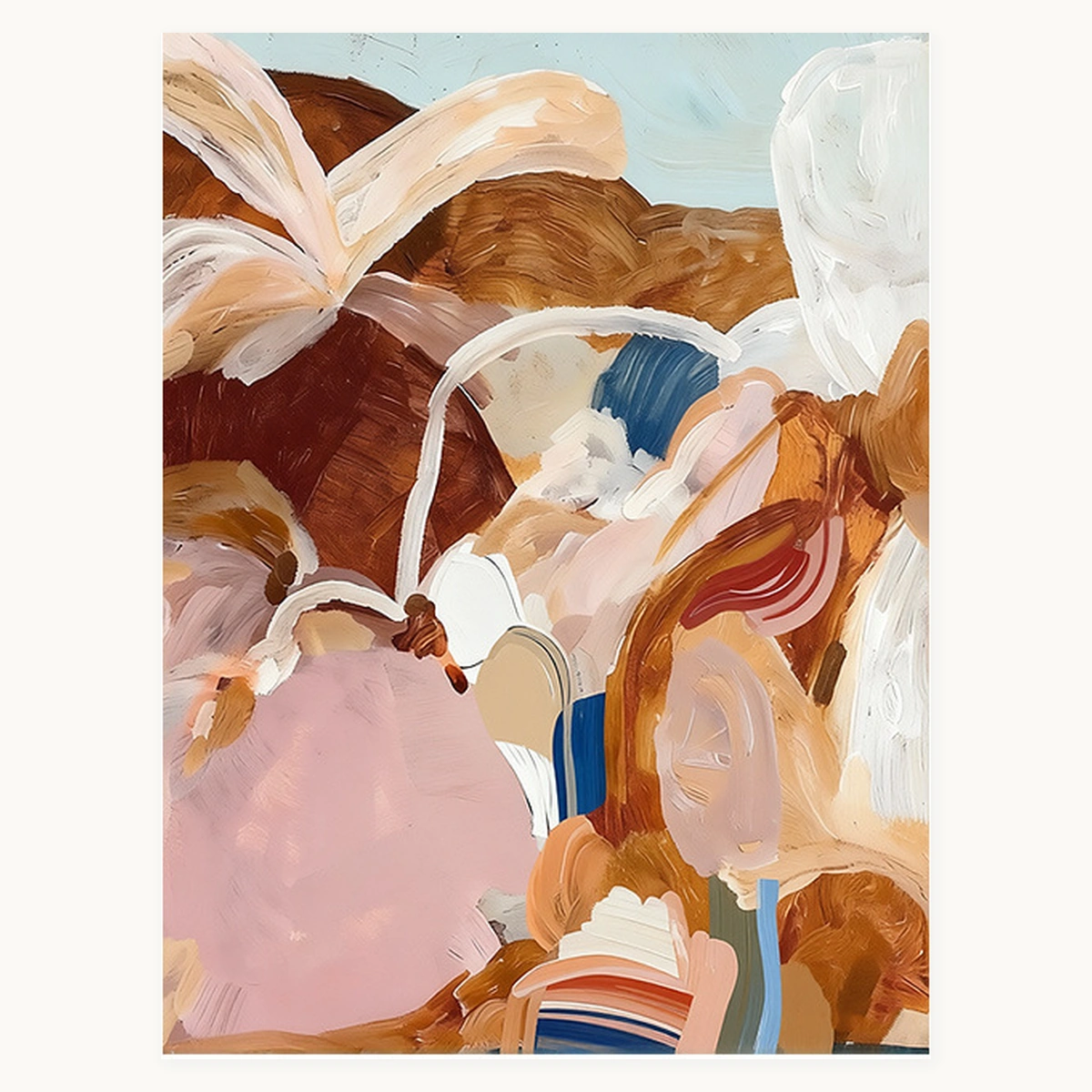
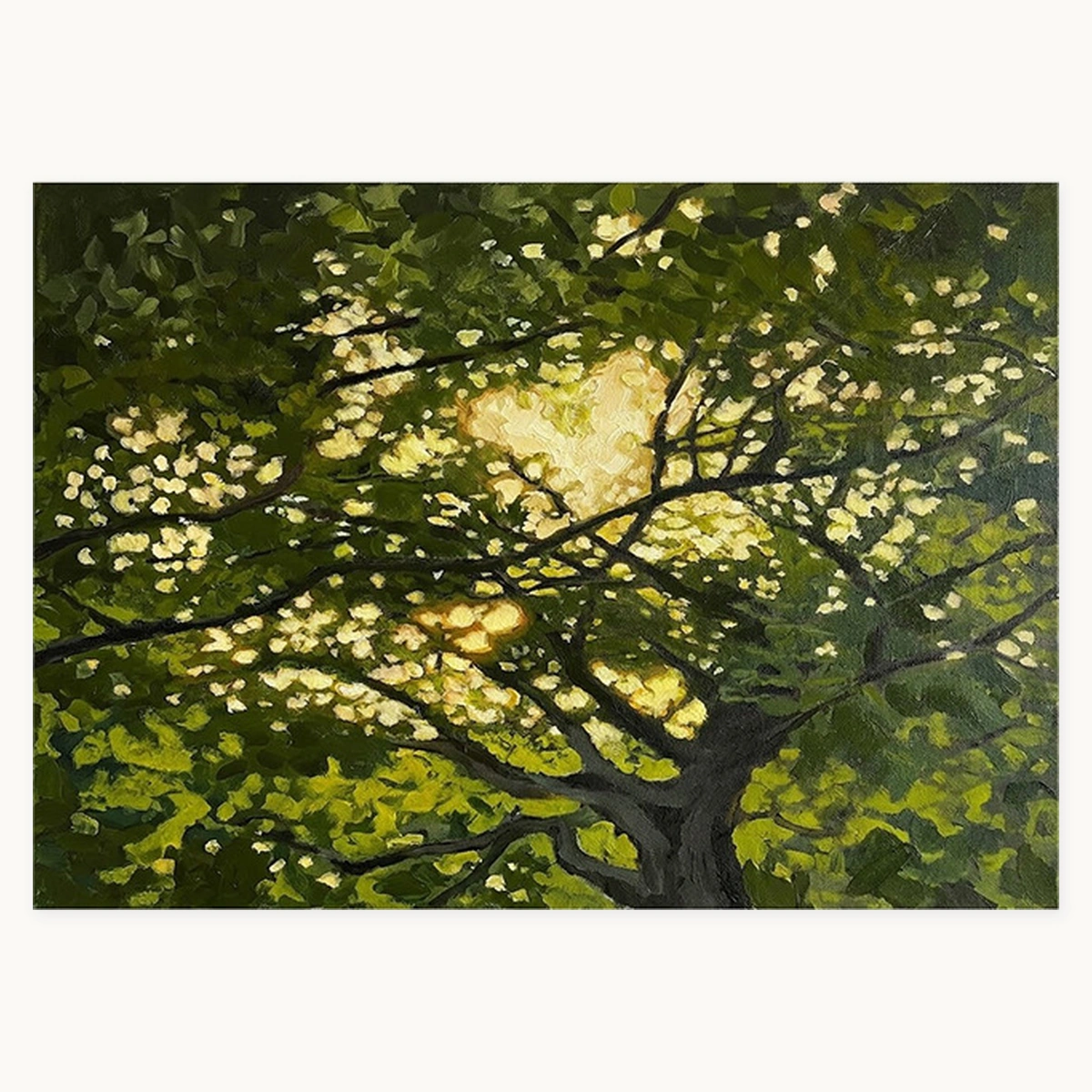
Placement idea: let the darker botanical lead above a sofa or console, then use the abstract on an adjacent wall where its lighter ground can relieve the visual density. If they share one wall, make the spacing generous and avoid adding a third highly detailed work between them.
Modern and vintage art: keep the contrast, control the edges
The purpose of combining modern and vintage art is not to disguise their difference. A crisp contemporary work can make a vintage floral feel less nostalgic, while the older visual language can keep a modern room from looking impersonal. Trouble begins when the frame profiles, wall color, furniture and artwork all compete to explain the contrast.
Use one of two approaches. The first is a shared edge: similar frame tone or mat treatment gives unlike images a common boundary. The second is deliberate separation: keep the vintage piece in a quieter area and allow the contemporary work to take the main sightline. Both are more convincing than scattering several ornate and minimal frames at random.
Violet Garden has a warm ground, dark violet flowers and subdued green foliage. Chromatic Symphony uses dense fields of emerald, burgundy, coral, orange, cream and charcoal. Their subjects are far apart, but their deep greens and wine tones create a workable link. The abstract has broader movement and stronger color contrast, so it should lead. The floral becomes a slower, more detailed counterpoint rather than a second headline.
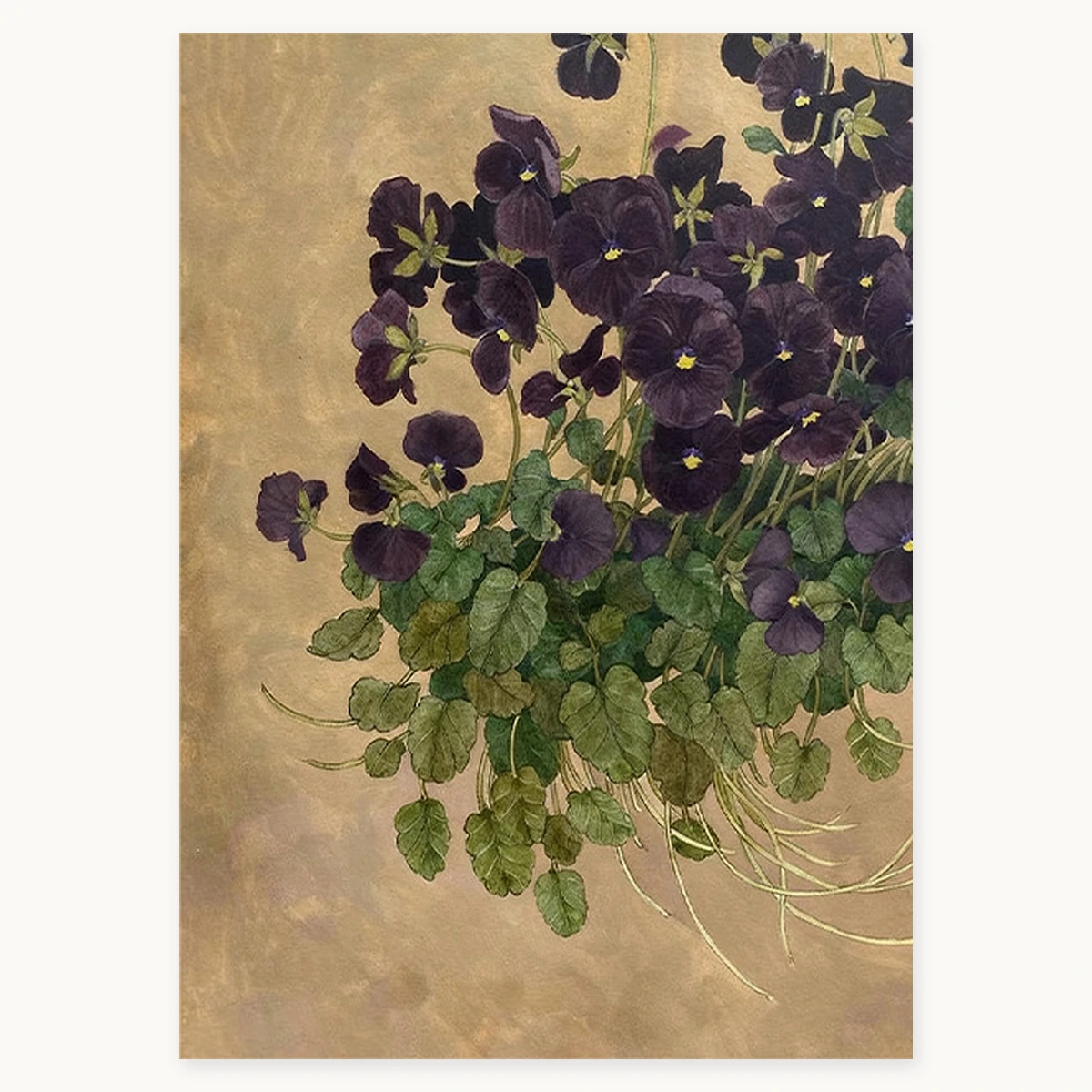
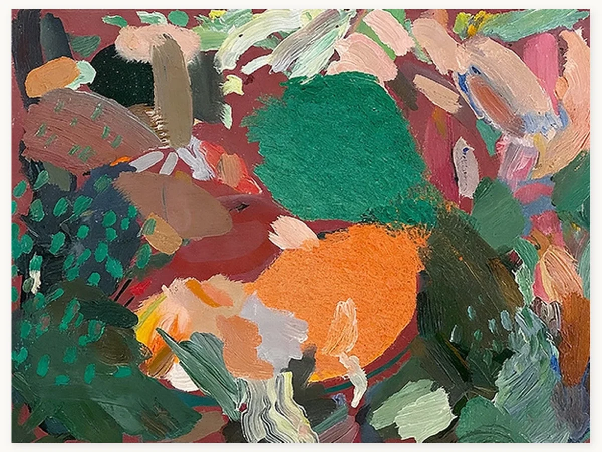
If the room already contains patterned upholstery, carved furniture or a strong rug, simplify the framing and leave more open wall around the pair. The artwork does not need additional decorative cues to announce that one piece is vintage and the other contemporary.
Asian-inspired and contemporary art: relate restraint, not symbols
Asian-inspired art should not be reduced to a motif that gets repeated around the room. Bamboo, birds or calligraphic brushwork do not require matching ornaments. A more respectful and visually useful connection is restraint: compare the balance of occupied and empty space, the pace of the marks, and the relationship between soft and decisive edges.
Bamboo Stillness uses a light ground, vertical bamboo, flowers, birds and insects, with large areas of open space. Still Form is an abstract built around a radiating circular form in pink, ivory and muted gold. Their shared quality is not subject matter. It is controlled breathing room around a concentrated centre of activity. Both are visually quiet at the perimeter and more active near the focal form.
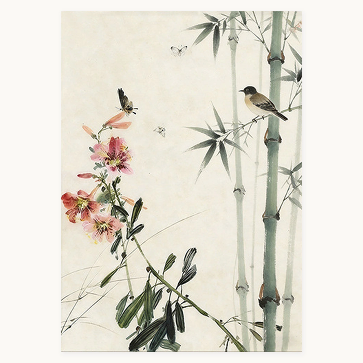
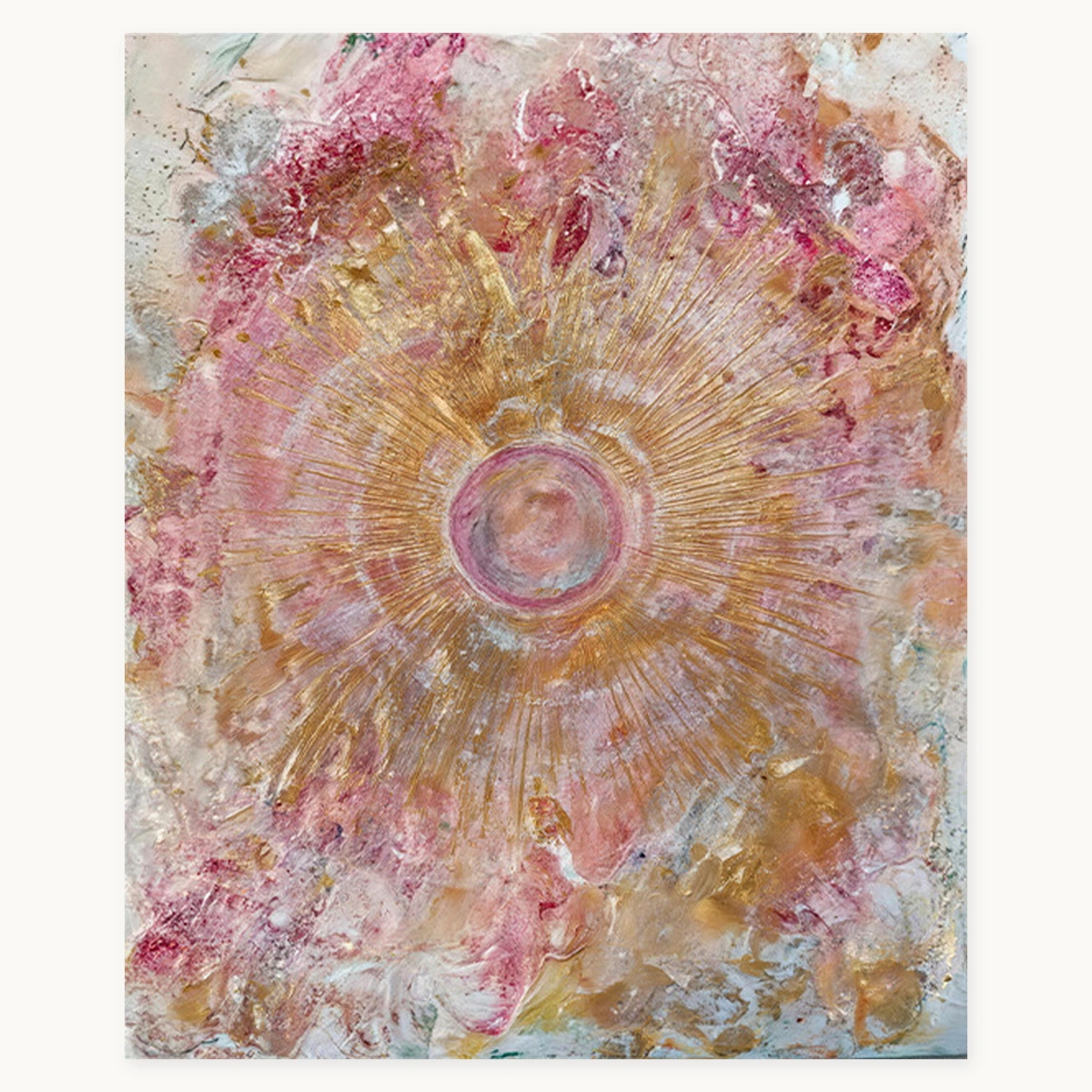
Keep these works apart rather than forcing them into a tight pair. A vertical bamboo painting can anchor a narrow wall, while the abstract can sit across the room where its circular centre is visible from the entry. Similar light grounds help the eye travel between them, but the subjects remain independent.
Let one style lead
Hierarchy is the clearest difference between an eclectic room and a random one. If three paintings have equal scale, equal contrast and equal prominence, the eye may bounce between them. Choose one lead work, then ask the others to support it through repetition, relief or counterpoint.
A lead can be established in several ways. Place it on the longest sightline. Give it the widest wall. Use the largest size. Surround it with more empty space. Or choose the work with the strongest dark-light contrast. Supporting pieces can still be distinctive, but they should not all use the same tools to demand attention.
Let one style lead
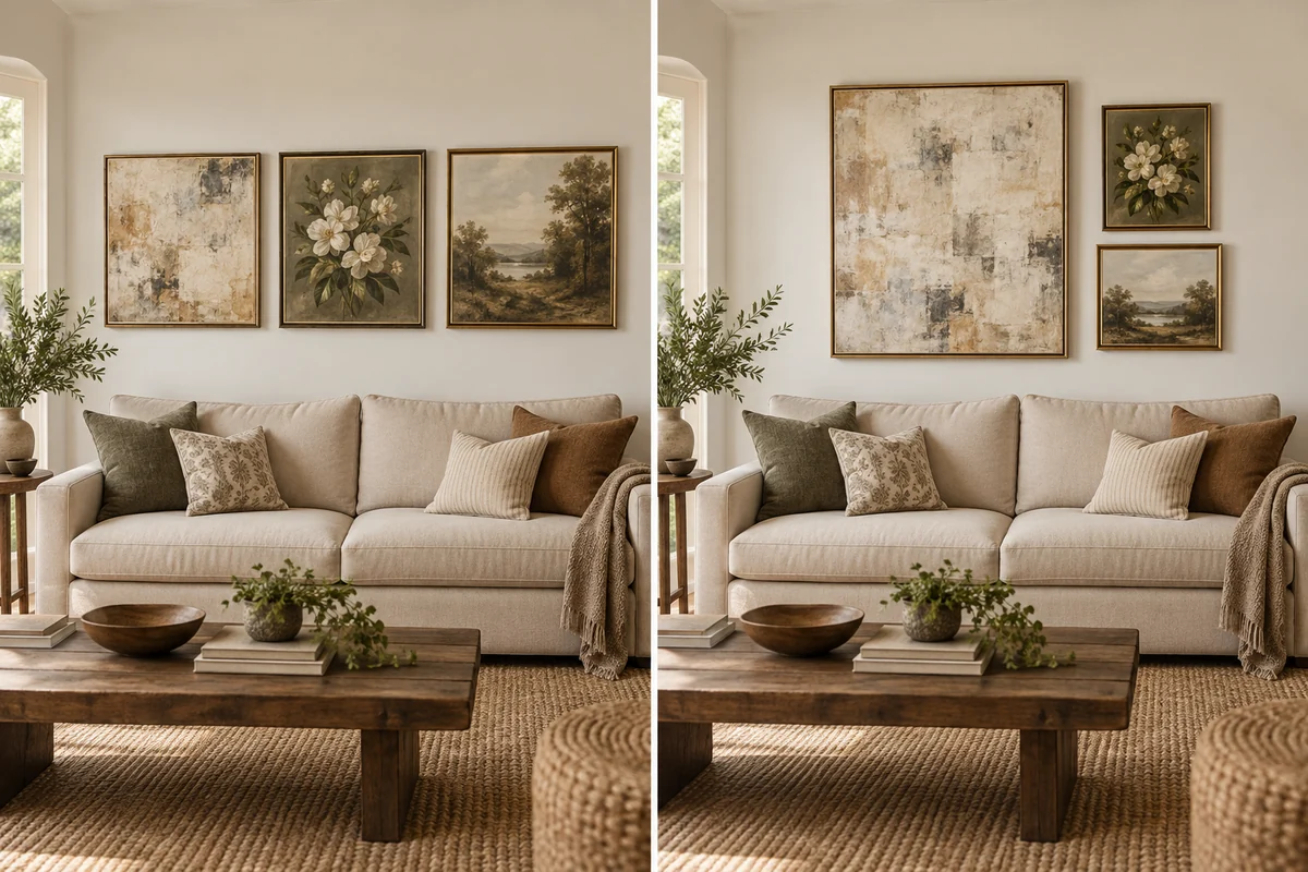
Clear hierarchyOne lead, two supporting works
Frames can connect styles, but they should not flatten them
Frames are useful because they create a repeated edge around unlike images. They can also make a mixed collection feel forced when every work is placed in an identical profile regardless of its proportions and surface. Aim for a family resemblance, not a uniform.
- Repeat a tone, vary the profile. Two warm wood frames can have different widths while still reading as related.
- Use a quiet frame for the lead. A visually strong painting rarely needs the heaviest frame in the room.
- Let one work remain unframed when its painted edge and texture suit the room. The contrast can keep a group from feeling over-designed.
- Check the actual outer dimensions. A frame changes scale and spacing, not only appearance.
For a fuller comparison of edge treatments, read Framed vs Unframed Oil Paintings. When mixing both in one room, compare the framed outer size with the unframed canvas size before deciding where each work belongs.
Use color as a bridge, not a matching rule
A shared color can make different styles speak to one another, but it does not need to be the dominant color in every painting. Look for a minor accent in the lead work that becomes more prominent in a supporting piece. This creates a bridge without making the room feel themed.
For example, a warm neutral abstract may contain a small blue passage. A landscape across the room can repeat that blue more openly. The connection registers, yet the subjects and overall palettes stay different. Wall color, upholstery and rugs also affect whether a repeated tone feels obvious or subtle. Our guide to matching wall art with room colors explains how to repeat, contrast or bridge a room palette without chasing an exact match.
Mixing styles on one wall versus across the whole room
On one wall
A single wall needs tighter editing because every work is seen at once. Start with the lead, then add no more than one or two supporting pieces until the spacing and outer silhouette feel settled. Aligning a centre line is not mandatory, but the gaps should look deliberate. Small changes in spacing are more noticeable when subjects and frames already differ.
Across the room
A room-wide arrangement can hold more contrast because the works are encountered in sequence. Stand at the doorway, the main seat and the route into the next room. At each viewpoint, note which paintings appear together. Two individually successful walls can still compete if both present a large, dark focal point in the same view.
Scale is central to that decision. Before ordering, compare the artwork dimensions with the furniture and available wall field rather than relying on a close product image. The oil painting size guide gives a practical measurement process for sofas, consoles and open walls.
How to know when to stop adding art
Stop when each work has a role and the room still has places for the eye to rest. A useful test is subtraction. Temporarily remove the newest piece and look at the room from the doorway. If the hierarchy becomes clearer and no connection is lost, the room did not need it.
Other warning signs include three or more equal focal points in one view, a row of frames that is denser than the furniture below it, repeated colors that feel too literal, or a small work squeezed into a gap simply because the wall was empty. Empty wall is not unfinished. It is the spacing that makes mixed styles legible.
A practical room check before you hang
- Name the lead. If you cannot identify the first work the eye should meet, reduce the number of strong candidates.
- Name the link. Be specific: muted olive, warm wood, vertical rhythm, open ground, or comparable visual weight.
- Measure the outer size. Include the frame and use paper templates on the wall.
- Check three viewpoints. Use the doorway, main seat and connecting route, not only a close front view.
- Photograph the arrangement in grayscale. This reveals dark-light competition that color can disguise.
- Remove one piece. Keep it out if the room becomes calmer without losing the intended connection.
Common mistakes
| Mistake | Why it feels random | Better adjustment |
|---|---|---|
| Every work is a focal point | Equal scale, contrast and placement create competition. | Enlarge or isolate one lead; quiet the supporting positions. |
| Matching only by subject | Three botanicals can still clash in tone, density and scale. | Compare visual weight and palette as well as subject. |
| Too many frame languages | Heavy black, ornate gold and pale wood create unrelated outlines. | Repeat one frame tone or simplify the strongest profile. |
| Filling every gap | Small pieces become visual punctuation with no sentence. | Protect empty wall and add only when a work has a clear role. |
Frequently asked questions
Can abstract and traditional art go in the same room?
Yes. Let one style lead and use a specific connection such as a repeated color, similar visual weight or related frame tone. Keep enough space between strong works so the contrast reads as intentional rather than competitive.
Do all frames need to match when art styles are different?
No. Matching every frame can flatten the character of the artwork. A shared wood tone or metal finish can create continuity while profile width, depth and framing treatment vary.
How many art styles can one room hold?
There is no fixed number, but two or three clear visual languages are easier to organise than many small exceptions. The practical limit is reached when you can no longer identify the lead or explain the link between the works.
Should mixed artwork share the same color palette?
It only needs a bridge, not an identical palette. One accent color can recur across otherwise different works, or the connection can come from frames, scale, negative space or visual density instead.
Can I mix framed and unframed paintings?
Yes. The difference can create a useful rhythm, especially when the unframed canvas is the lead. Compare outer dimensions and edge depth so the group remains balanced.
How do I balance a dark painting with a light one?
Give the darker work more breathing room or place the lighter work at a larger scale. Dark color and sharp contrast add visual weight, so equal physical dimensions do not always look balanced.
What should I remove if the room still feels random?
Remove the piece that has neither a leading nor supporting role. If it introduces a new frame tone, unrelated palette and separate scale without strengthening the room, it is the clearest candidate to edit out.
For more practical decisions about choosing, sizing and displaying paintings, visit the Room Oil Painting Art Guide.